Finally. My Portfolio Is Live.
July 2026 · 7 min read
The Irony
If you're a frontend dev, you already know this one: we build beautiful things for other people's brands all day, then completely freeze when it's our own turn. No brief, no client feedback, no deadline. Just you, a blank canvas, and way too many opinions about your own work. I've been trying to build this portfolio for years. Not months, years. Every version felt "not good enough" the moment I looked at it a second time, so I'd scrap it and start over.
Perfectionism is a great employee and a terrible business partnerWhy devs freeze on their own work
When you build for clients, someone else absorbs the risk of a decision being wrong: a brief, a brand guideline, a stakeholder sign-off. Build for yourself and every decision is yours alone to defend, which somehow makes each one feel heavier, not lighter.
What Changed
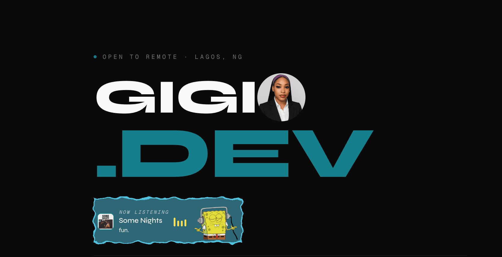
What finally got me to ship: I stopped trying to make it impressive and started trying to make it feel like me. Not just a résumé with better CSS, but something with every part worked out slowly, on purpose. The "about" line went through more drafts than I'd like to admit. There's a Craft & Experiments section for the small builds that never needed a full case study but deserved somewhere better than a repo nobody checks. Buttons have their own click sound. The blog you're reading this on has real categories instead of being an afterthought. And yes, there's a SpongeBob that vibes to whatever I'm listening to on Spotify, and falls asleep when I'm not. None of it was the point on its own. Together, it just finally felt like mine.
If You're Stuck On Yours
If you've been "working on my portfolio" for the past two years, here's what actually moved me from stuck to shipped:
Stop aiming for impressive
Impressive is a moving target. There's always a portfolio out there sleeker than yours. Aim for "sounds like me" instead. That's a target only you can hit, which makes it finishable.
Notice when it's perfectionism, not the work
If you're rebuilding the same section for the fifth time, the problem usually isn't the section anymore. It's that you've stopped being able to see it clearly. That's a sign to step away, not to keep tweaking.
Ship the version you have
Not the version in your head. The gap between those two is where most portfolios die in draft form for years.
Nobody is judging it as hard as you are
The version of your portfolio that feels embarrassingly unfinished to you reads as perfectly fine, often impressive, to everyone else. You're the only one who's seen every draft.
Add personality after, not before
Get the structure live first. The fun details, widgets, easter eggs, voice, are much easier to bolt onto something real than to design perfectly in a vacuum.