Animation Patterns I Use Every Day
Jan 2026 · 6 min read
Entrance Animations
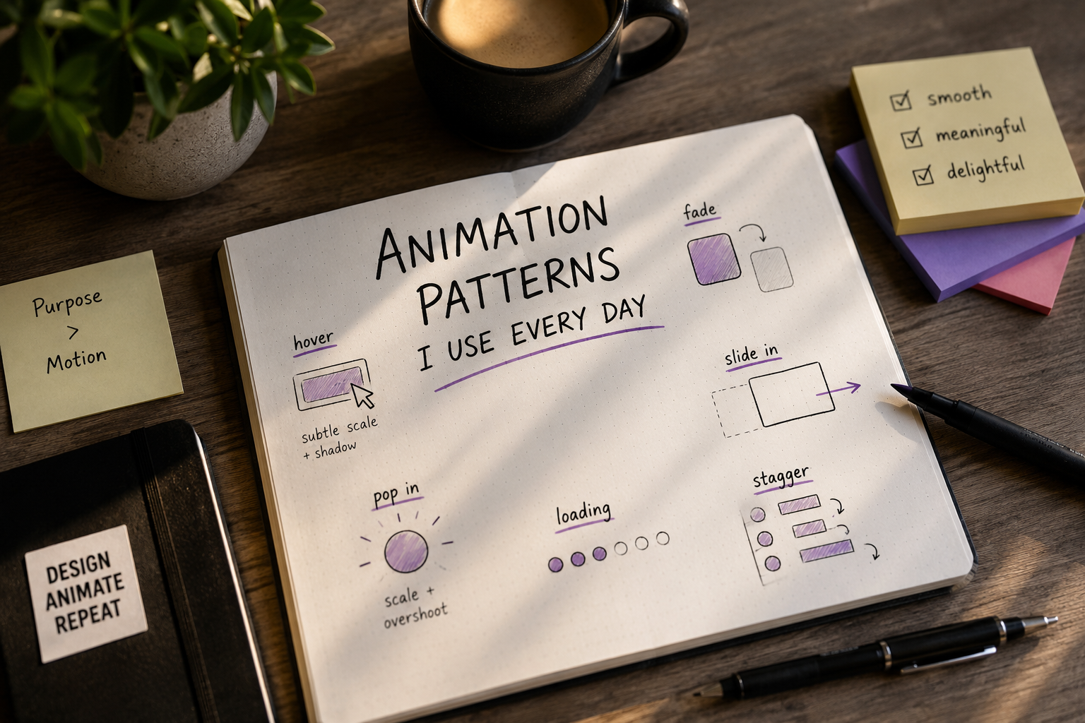
Most of what makes an interface feel considered isn't the animation itself — it's the restraint around it. A staggered fade-in on a list, a small y-offset on scroll-into-view, nothing more. The goal is to make the page feel like it's responding to the user, not performing for them. I default to opacity + a small translate (8-16px) with an easeOut-style curve. Anything bouncier reads as playful, which is right for some brands and wrong for most product UI.
Staggering the right way
A flat 0.05-0.1s delay per item, capped around 6-8 items, keeps a list feeling snappy instead of sluggish. Past that many items, I stop staggering entirely — the eye can't track it anymore and it just adds latency to perceived load.
Images used for editorial purposes.
Hover & Micro-interactions
Hover states are where most of my animation budget actually goes, because they're the moments users directly control. A button that responds instantly to a cursor feels alive; one with a 400ms transition feels laggy, even if the rest of the page is buttery. My rule of thumb: hover/interaction transitions stay under 300ms, entrance animations can go up to 500-600ms, and anything the user is actively controlling (drag, scroll-linked) should have effectively zero added delay.
Group-hover for sibling dimming
One pattern I reach for constantly: dimming sibling list items when one is hovered, using Tailwind's group/group-hover rather than JS state. It's cheap, it's declarative, and it doesn't fight with entrance animations running on the same elements.